
Multiple UX improvements across the platform
This involved implementing multiple UX enhancements aimed at improving usability, efficiency, and clarity across the platform. The focus was on refining existing features to better support users’ daily workflows, reduce friction, and improve overall task completion. These improvements were informed by recurring usability challenges and feedback observed across different use cases.
Key enhancements included improving text formatting capabilities to support clearer communication, as well as optimizing survey workflows to reduce data loss and improve efficiency.
Company
Taidii Pte Ltd
Role
UI Designer
Tools
Figma
Enhancing Text Formatting
Problem
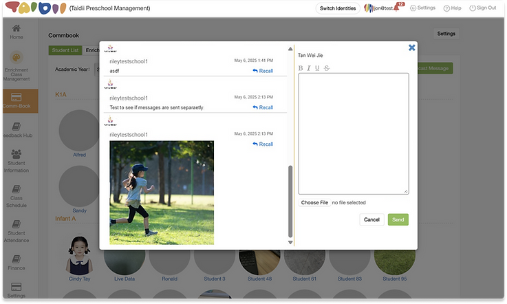
Teachers needed a way to emphasize important information when communicating with parents through the messaging platform. However, the absence of basic text formatting options (such as bold or underline) limited their ability to highlight key details clearly. As a result, teachers relied on typing in all capital letters as a workaround, which reduced readability and caused messages to appear less professional. This created friction in communication and increased the risk of important information being misunderstood.
Solution
To improve message clarity and professionalism, text formatting functionality was introduced across both mobile and desktop platforms, designed to fit naturally into existing workflows.
On mobile, users can long-press selected text to access formatting options such as bold, italic, underline, and strikethrough. On desktop, users can highlight text and apply formatting via a familiar toolbar, aligning with platform-specific conventions and minimizing the learning curve.
This enhancement allows teachers to emphasize key information clearly and professionally, improving readability and communication with parents while maintaining consistency across devices.
Mobile App Design


Web Design
Enhancing Survey Efficiency
Problem
Parents faced difficulties when completing survey forms on the platform due to the lack of an auto-save function. Any progress made was lost if the form was exited or interrupted, requiring users to restart the entire process. This resulted in frustration and unnecessary time spent re-entering information.
In addition, the platform did not provide much visibility into the status of survey forms. Users were unable to easily identify which forms were incomplete or pending, making it difficult to track progress and manage submissions effectively.
Solution
To address these issues, an auto-save feature and status tags were introduced to improve the survey form experience. The system now automatically saves users’ progress periodically, ensuring that information is not lost if a form is exited midway or interrupted. In scenarios where auto-save fails, a clear error message is displayed to immediately alert users.
In addition, two new status tags — Not Started and Incomplete — were introduced to complement the existing Completed and Expired statuses. This provides users with a clear overview of their form progress, making it easier to identify which surveys still require action.
Together, these improvements reduce frustration, prevent data loss, and create a more reliable and efficient form-filling experience for parents.
Mobile App Design

Auto save fail

Added new status tags